Friday 26 September 2008

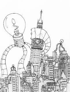
Go with the flow!


Seeing as I'm feeling generous, here's a sneak peek at a work in progress! If you look hard enough you'll see the sketch lines in the layout in places.. I'll work this one up in Illustrator soon and decide on (and position) the type whilst I'm at it... I may try a different approach and work on colouring it up in photoshop... but I might not!... can you guess who it might be for?

SCIENCE FICTION DOUBLE FEATURE


Here's 4 posters for 2 more bands - Postmortem Maniacs a UK Based Horror Rock act, I created 2 variations for an A3 poster that they intend to sell at their gigs, and the Creature Feature ones happened while I was experimenting with a character design for the Grim Reaper.. when I started to distort the body the idea for the poster(s) was born. 'Creature Feature' are one of the most original bands out there in my opinion.. if you're a fan of Tim Burton/Danny Elfman you should really go give them a listen!

I sent the layouts for the 2 October gigs to the band this morning, and I'll await their feedback!

Next up... KITTIE are playing Central Station in Wrexham in October.... Hello poster design!!

Tuesday 2 September 2008

No Turkeys for Christmas here!


Never one to miss an opportunity to support Zombina and the Skeletones.. how's this for recycling? This is the previous post's Santa pt to good use... this is an excellent bill as both Zombina and The She Creatures are 2 of the UK's most exciting bands.. Go on.. put a ticket on your Christmas List!

Monday 1 September 2008

a more traditional christmas card... not!


Here is another proposed Christmas Card I've submitted to moo.com and perhaps one that's more in keeping with my usual tastes!.. meet the ghost of christmas night.... Merry Corpsemas!!

The Action Design


Here's another poster I put together the other day. This is for a great band called 'the action design'.. their debut album is due out in September (YAY!) and I thought I'd celebrate it by putting a gig poster together for them. I've done 2 versions, of which this is the first. I reworked the type quite a bit on this one before settling for a pretty standard 'baseline' layout.. I think the simplicity of the 2 colours work pretty well and it kinda has the 'feel' of their music somehow... sounds a bit daft.. but give them a listen and see what you think.