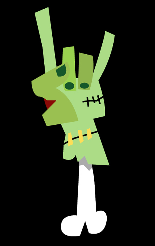
Hail and Kill.. It's the infamous 'Rockfist'...

 Here's a 'work in progress' for a previously posted sketch. I don't think it's far off, but I just need to do something with the eyes as they are a bit tiny!

 Cant believe I never thought of this before! Inspired by a pretty old post I did of 'Frankenweenie - The Teenie Weenie Terror' here's Keg chomping, Basketball playing, hirsuite horror 'Teenie Weenie Wolf'!
 Here's a work in progress of the Tunnel Troll from the previous post's sketch. I don't know why, but I keep thinking of him as a Grumpy Old Irish born Troll for some reason?


 This is more like it.. starting to shake off the dust now.. Put this together today (from a sketch that appears in a previous post) and really enjoyed doing it.. Initially it was flat colour and no outline details (and the wolf was black) but the beauty of Illustrator means that I can experiment with the design as I'm building it, and this finished piece (I think) would look great in a Children's picture book maybe?
 Yet more Catwoman artwork. I think I've boiled this one down to it's absolute simplest form now though. Really pleased with the blatant disregard for anatomical perfection... let's face it, I'm never going to achieve that with my drawing style though!
 I Know I've done a couple of takes on Mr Kruger, but this one is most certainly my favourite. Real simple design, basic shapes and super quick to put together, I probably spent more time deciding on the fonts to use!!


 Hullo Everyone!

 Here's a little insight into how my drawings tend to develop.. from the initial sketch (posted earlier) I work up a vector layout in Illustrator. This then allows me to play about with the colours. I generally have a 'vision' of how I want the colours to sit on an image, but Illustrator's flexibility allows me to experiment 'on the go' as it were.. You can see how the colours have changed slightly from the middle image to the framed image. I'll put together the soldiers colleagues from the sketch when I get a minute, but in the meantime I've placed him in a composite environment to give him a sense of belonging... he's so lonely on his own!!